With the development of
TLCockpit continuing, I found the need for and easy exchange format between the
TeX Live Manager tlmgr and frontend programs like TLCockpit. Thus, I have implemented JSON output for the
tlmgr info command.

While the format is not 100% stable I might change some thing I consider it pretty settled. The output of
tlmgr info --data json is a JSON array with JSON objects for each package requested (default is to list all).
[ TLPackageObj, TLPackageObj, ... ]
The structure of the JSON object
TLPackageObj reflects the internal Perl hash. Guaranteed to be present keys are
name (String) and
avilable (Boolean). In case the package is available, there are the following further keys sorted by their type:
- String type: name, shortdesc, longdesc, category, catalogue, containerchecksum, srccontainerchecksum, doccontainerchecksum
- Number type: revision, runsize, docsize, srcsize, containersize, srccontainersize, doccontainersize
- Boolean type: available, installed, relocated
- Array type: runfiles (Strings), docfiles (Strings), srcfiles (Strings), executes (Strings), depends (Strings), postactions (Strings)
- Object type:
- binfiles: keys are architecture names, values are arrays of strings (list of binfiles)
- binsize: keys are architecture names, values or numbers
- docfiledata: keys are docfile names, values are objects with optional keys details and lang
- cataloguedata: optional keys aare topics, version, license, ctan, date, values are all strings
A rather long example showing the output for the package
latex, formatted with
json_pp and having the list of files and the long description shortened:
[

      "installed" : true,
      "doccontainerchecksum" : "5bdfea6b85c431a0af2abc8f8df160b297ad73f6a324ca88df990f01f24611c9ae80d2f6d12c7b3767308fbe3de3fca3d11664b923ea4080fb13fd056a1d0c3d",
      "docfiles" : [
         "texmf-dist/doc/latex/base/README.txt",
         ....
         "texmf-dist/doc/latex/base/webcomp.pdf"
      ],
      "containersize" : 163892,
      "depends" : [
         "luatex",
         "pdftex",
         "latexconfig",
         "latex-fonts"
      ],
      "runsize" : 414,
      "relocated" : false,
      "doccontainersize" : 12812184,
      "srcsize" : 752,
      "revision" : 43813,
      "srcfiles" : [
         "texmf-dist/source/latex/base/alltt.dtx",
         ....
         "texmf-dist/source/latex/base/utf8ienc.dtx"
      ],
      "category" : "Package",
      "cataloguedata" :
         "version" : "2017/01/01 PL1",
         "topics" : "format",
         "license" : "lppl1.3",
         "date" : "2017-01-25 23:33:57 +0100"
       ,
      "srccontainerchecksum" : "1d145b567cf48d6ee71582a1f329fe5cf002d6259269a71d2e4a69e6e6bd65abeb92461d31d7137f3803503534282bc0c5546e5d2d1aa2604e896e607c53b041",
      "postactions" : [],
      "binsize" :  ,
      "longdesc" : "LaTeX is a widely-used macro package for TeX, [...]",
      "srccontainersize" : 516036,
      "containerchecksum" : "af0ac85f89b7620eb7699c8bca6348f8913352c473af1056b7a90f28567d3f3e21d60be1f44e056107766b1dce8d87d367e7f8a82f777d565a2d4597feb24558",
      "executes" : [],
      "binfiles" :  ,
      "name" : "latex",
      "catalogue" : null,
      "docsize" : 3799,
      "available" : true,
      "runfiles" : [
         "texmf-dist/makeindex/latex/gglo.ist",
         ...
         "texmf-dist/tex/latex/base/x2enc.dfu"
      ],
      "shortdesc" : "A TeX macro package that defines LaTeX"

]
What is currently not available via
tlmgr info and thus also not via the JSON output is access to virtual TeX Live databases with several member databases (multiple repositories). I am thinking about how to incorporate this information.
These changes are currently available in the
tlcritical repository, but will enter proper TeX Live repositories soon.
Using this JSON output I will rewrite the current TLCockpit tlmgr interface to display more complete information.
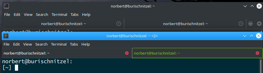 In the above screen shot you see the tabs in the upper part are hardly distinguishable, and in the lower part the active tab is clearly indicated with different colors. Searching for relevant search terms brings up a variety of suggestions, most of them not working. I finally found this one and adapted the code therein to fit my need. The solution is to edit
 In one of the answers it is stated that:

 My first try, taken from searches on the web, was to add the context menu via the
  That s it, the context menus are now correctly adapted to the displayed content. If there is a simpler way, please let me know.
 My favorite this time is
  To understand why this is a problem, I restart from the already linked blog: Our packages have revision numbers based on the latest change revision of all the contained files. Since subversion has a linear history and central repository, this guarantees that in contrast to version numbers provided by authors the revision numbers are strictly increasing .
Well, it turned out that this assumption was wrong. Because it is easy to trick subversion to have wrong revision numbers for files. Consider the following flow:
To understand why this is a problem, I restart from the already linked blog: Our packages have revision numbers based on the latest change revision of all the contained files. Since subversion has a linear history and central repository, this guarantees that in contrast to version numbers provided by authors the revision numbers are strictly increasing .
Well, it turned out that this assumption was wrong. Because it is easy to trick subversion to have wrong revision numbers for files. Consider the following flow:
 The code for pulling the data from the UDD, as well as converting and importing it into Neo4j is available on
  Last saturday the
  The whole mess comes from the fact that, when there is no ~/.vimrc, vim loads defaults.vim after vimrc.local and thus overwriting several settings put in there.
There is a comment (I didn t see, though) in /etc/vim/vimrc explaining this:
The whole mess comes from the fact that, when there is no ~/.vimrc, vim loads defaults.vim after vimrc.local and thus overwriting several settings put in there.
There is a comment (I didn t see, though) in /etc/vim/vimrc explaining this: